
We analysed more than 40,000 sign comparisons drawn from opposition decisions published by the INPI, the French Trademark Office, isolating for each the degree of similarity retained on every level and the conclusion reached on the signs at issue. Three findings emerge.
Finding no. 1: a single genuine assessment across the visual and aural criteria
INPI oppositions decisions use five degrees to qualify similarity: dissimilar, weakly similar, similar, highly similar, identical.
The Office retains one degree of assessment for visual similarity and another for aural similarity.
Across more than 30,000 comparisons where both aspects are qualified, the correlation between them reaches 0.905 (Spearman coefficient, where 1 corresponds to perfect equivalence).
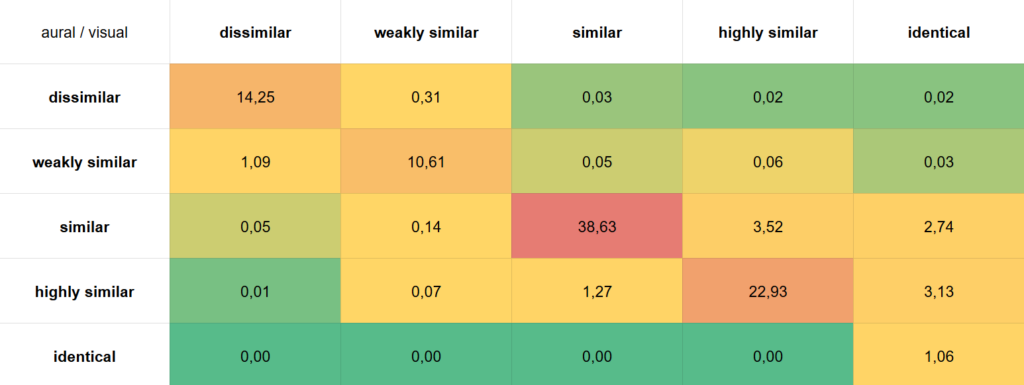
Cross-tabulating the two qualifications makes the phenomenon tangible. In 87.5 % of decisions, the degree retained is exactly the same on both sides. In a further 9.5 % of cases, it differs by only one degree, for instance similar on one side and highly similar on the other. In total, 97 % of decisions retain the same degree or an adjacent one.
That leaves the clear divergences, where similarity is retained on one level and ruled out on the other, accounting for only 0.4 % of the corpus. One third are cases where visual similarity is weak or absent while aural similarity is retained, and two thirds the reverse. In those situations visual similarity prevails, carrying roughly twice the weight.
What this means in practice.
Hoping to win on one aspect what has been lost on the other is illusory: the two qualifications are correlated in 97 % of decisions. The Office does not add up conclusions reached on independent criteria. It first forms an overall impression, then expresses it aspect by aspect to give reasons for its decision. The argument must therefore bear on the overall impression, and above all on visual ground.
Finding no. 2: a threshold effect, not a gradient
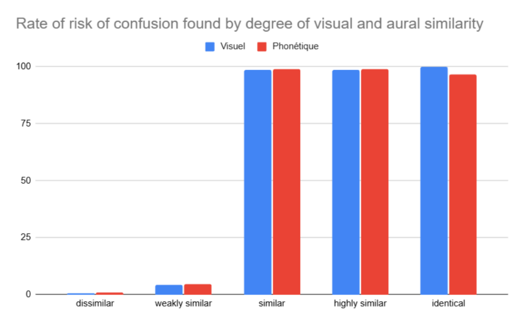
The scale used by the Office in its opposition decisions looks like a gradient: dissimilar, weakly similar, similar, highly similar, identical. The data show that there is in fact a vast step between the qualifications weakly similar and similar.
Moving from “weakly similar” to “similar” shifts the rate of risk of confusion found, which determines the outcome of the opposition in 96 % of cases, from 4.1 % to 98.7 %.
One notch of qualification, nearly 95 points of difference on the outcome.
The consequence is direct: the qualification retained by the Office does not describe a degree of resemblance, visual resemblance in particular. It announces the decision.
What this means in practice.
The real battle is terminological. Securing “similar” rather than “weakly similar” is worth the case.
The whole argument must aim at moving the cursor up one notch where the signs are weakly similar. Arguing the nuance between “similar” and “highly similar”, by contrast, makes no statistical difference to the outcome.
Finding no. 3: conceptual neutralisation does not work
We then examined the relevance of acknowledging visual and aural proximity, then arguing that the difference in meaning or concept between the signs could genuinely neutralise the common overall impression they produce (CJEU, 12 January 2006, C-361/04 P, PICASSO/PICARO, EU:C:2006:25, § 20). Here too the data are unequivocal.
Among the comparisons where visual and aural similarity are qualified “similar” or higher, the result is unambiguous.
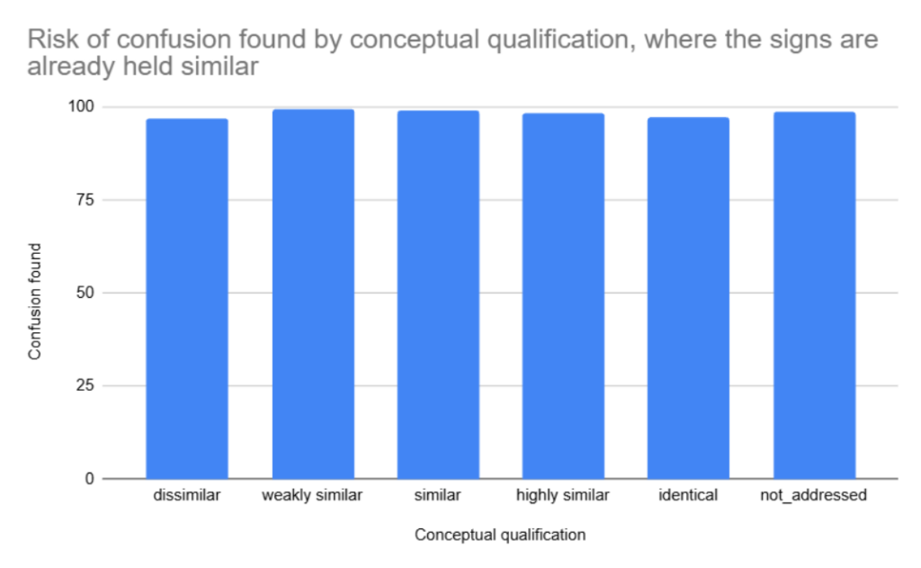
Even where a conceptual difference is established, the risk of confusion is still found in 97 % of cases. Statistically, a defence founded on conceptual divergence between the signs has only slim prospects of success.
Moreover, the conceptual criterion is examined in only 40 % of decisions, against more than 80 % for the visual and aural criteria.
It therefore remains a secondary criterion, almost a supporting one.
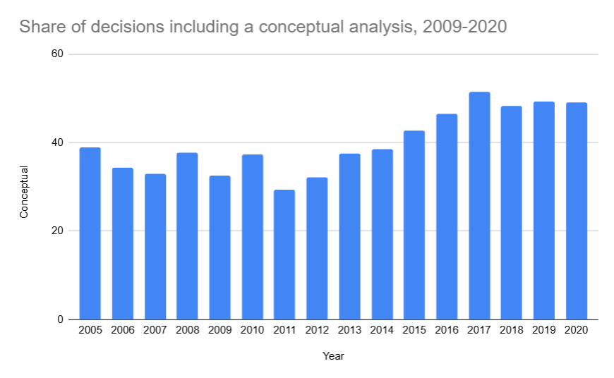
Its use is nonetheless growing markedly over time: one third of decisions took it into account in 2009, and since 2017 it features in more than half of them.
What this means in practice.
Conceptual neutralisation cannot be the main plank of a defence. It supports an argument that must first contest visual similarity.
What if the real driver in an INPI opposition lies elsewhere?
Sabel requires account to be taken of “distinctive and dominant components”, and practitioners mostly follow that instruction by instinct. Our three findings describe how the Office qualifies resemblance. None of them, however, explains why it settles on one degree rather than another. What our study does clearly confirm is that emphasising visual resemblance between the signs is an aspect not to be neglected by anyone seeking a successful opposition.
What tips a case is not only the degree of resemblance between the signs, but the element they have in common. Two marks sharing the word SPA see a risk of confusion found in 43 % of cases. Two marks sharing the word PLANETE, in 93 %. In both situations a whole word is taken over. Only the distinctiveness of that word changes.
The distinctiveness of the shared element is the variable left untreated by the triptych, and it will be the subject of a forthcoming analysis.